
Common QR Code Mistakes
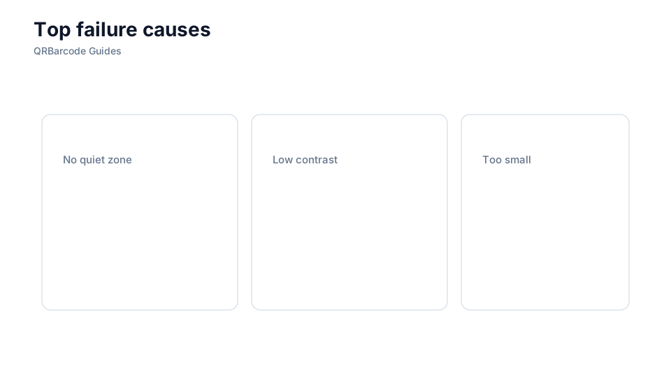
Missing quiet zones, low contrast, and undersized modules cause most field failures.
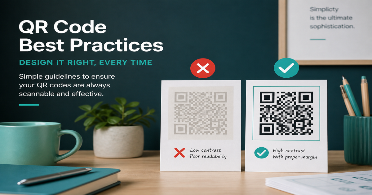
Most QR campaigns fail for predictable, fixable reasons — not because the technology is unreliable. Cropped quiet zones, weak contrast, tiny modules, and untested artwork account for the majority of support tickets and reprint costs. Use the QR code generator with defaults intact, then catch issues early in the QR scanner instead of after ten thousand labels ship.
Why it matters
QR codes look simple in slide decks, which leads teams to treat them as decorative squares rather than machine-readable symbols. A code that scans on a designer's flagship phone under office lights may fail on older Android devices in a dim warehouse. Review quiet zone rules and pre-print testing to build a checklist your whole org can follow.
How to apply it
Audit every QR before approval: margin, contrast, physical size, payload length, and destination URL. Make scanning part of sign-off, not an afterthought.
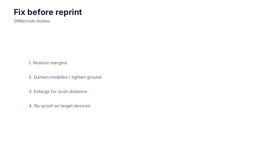
- Never crop into the quiet zone or place text inside the margin to save layout space.
- Match module size to the farthest expected scan distance, not just the artboard scale on screen.
- Confirm the destination loads on mobile networks, not only on office WiFi during design review.
Common mistakes
Chasing visual trends — inverted colors, heavy center logos, gradient modules — without re-testing destroys reliability. So does encoding a campaign URL that marketing changes the week after print. Destinations you do not control expire silently on packaging for years. See also contrast guidance and size guidelines when redesigns break scans.
Recommended tools
Rebuild suspect codes in the URL QR tool, run a structured proof pass with the QR Code Scan tool, and document what passed before sending files to press.