
QR Code Colors & Contrast
Dark modules on a light background remain the most reliable combination for phone cameras.
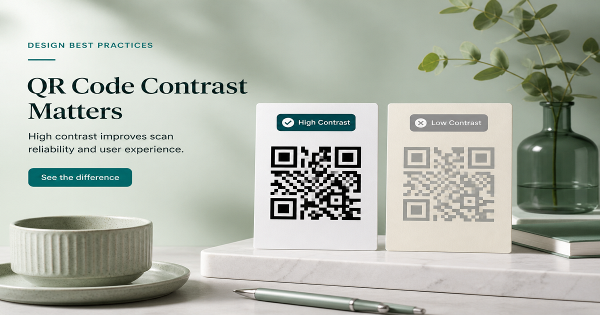
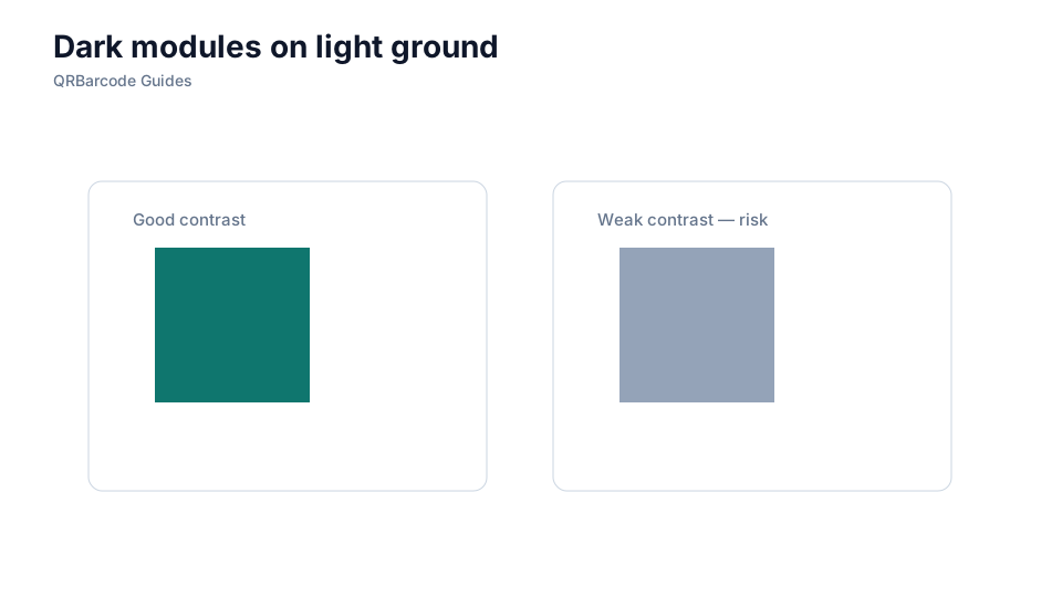
QR scanners read modules by comparing dark and light areas — not by recognizing your brand palette. Dark modules on a light background remain the most reliable combination across phone cameras, outdoor glare, and office lighting. Use the QR code generator to preview brand colors, then verify contrast with the QR scanner under the conditions your audience will scan in.
Why it matters
Low contrast is one of the top causes of failed scans, especially when marketing teams invert colors or use pastel modules on tinted stock. A code that looks fine on a monitor may disappear under sunlight or on matte packaging. Pair this guide with adding a logo and outdoor signage when brand color meets real-world lighting.
How to apply it
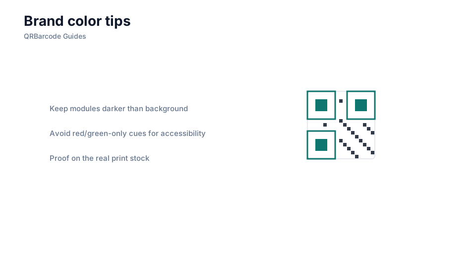
Start with black modules on white, then adjust only after testing. If you must use brand colors, keep modules significantly darker than the background and avoid gradients that blur module edges.
- Aim for strong luminance difference — dark navy on pale gray often works; yellow on white usually does not.
- Test the same artwork on screen, on paper, and outdoors if the placement will see daylight.
- Increase print size or error correction when brand colors reduce effective contrast.
Common mistakes
Inverted codes (light modules on dark fields) fail on many cameras unless contrast is extreme and size is generous. Gradients, textures, and photographic backgrounds behind modules also break binarization. Do not assume a designer's mockup equals a scannable code — cross-check with testing before print on multiple devices.
Recommended tools
Generate test codes in the URL QR tool, compare color variants side by side, and confirm winners in the QR Code Scan tool before sending art to press.